Now, we will create a Stacked Bar Plot with Python. Be sure to check out our previous tutorial on bar graphs with matplotib for a good foundation before proceeding.
First, here is our code:
import matplotlib.pyplot as plt
import pandas as pd
d = {'CLASS_TYPE': ['A','B','C','D','E'], 'MEN': [20,25,30,19,38], 'WOMEN': [21,31,55,22,39]}
df = pd.DataFrame(data=d)
classType = df["CLASS_TYPE"]
men_count = df["MEN"]
women_count = df["WOMEN"]
width = 0.35 # the width of the bars
fig, ax = plt.subplots()
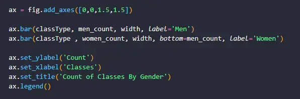
ax = fig.add_axes([0,0,1.5,1.5])
ax.bar(classType, men_count, width, label='Men')
ax.bar(classType , women_count, width, bottom=men_count, label='Women')
ax.set_ylabel('Count')
ax.set_xlabel('Classes')
ax.set_title('Count of Classes By Gender')
ax.legend()
for x,y1,y2 in zip(classType,women_count,men_count):
label = "{:.2f}".format(y1)
plt.annotate(label, # label text
(x,y1), # The point (x, y) to annotate
textcoords="offset points", # offset (in points) from the xy value
xytext=(0,6), # position (x, y) to place the text at.
ha='center') # horizontal alignment is center in this case
label = "{:.2f}".format(y2)
plt.annotate(label,
(x,y2),
textcoords="offset points",
xytext=(0,-14),
ha='center')
label = "{:.2f}".format(y1+y2)
plt.annotate(label,
(x,y1+y2),
textcoords="offset points",
xytext=(0,9),
ha='center')
plt.show()
Let’s explain what’s going on here:
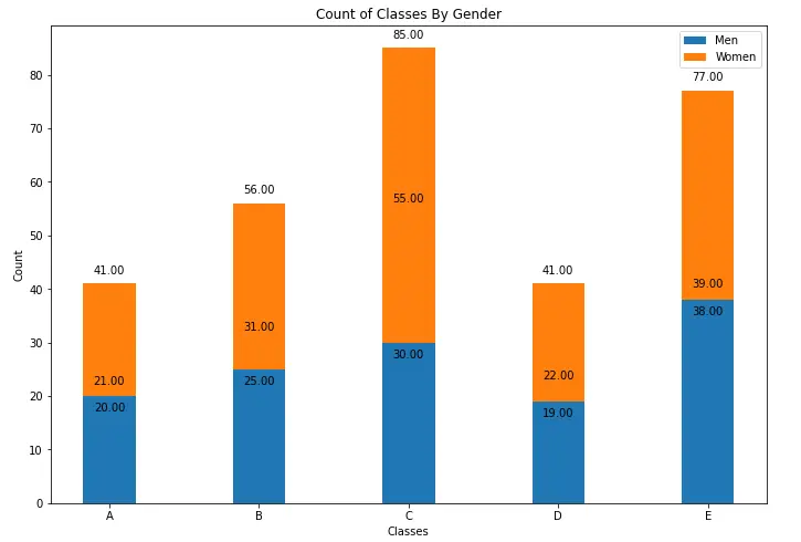
- A stacked bar chart or stacked bar graph, is a bar graph that is used to identify and compare parts of the whole. The bars are stacked one on top of the other and each bar in a stack is part of the whole. In this case, we are going to look at counts of MEN and WOMEN who belong to one of 5 classes in a sample dataset. When complete, our stacked bar will have two parts one for MEN and one for WOMEN.
- We declare our dataframe df with our sample dataset. The first column lists 5 classes (A,B,C,D,E) and is called CLASS_TYPE, the second column shows how many MEN belong to each class and the third shows how many WOMEN belong to each class.
- To create our plot, we create 3 separate lists from the dataframe columns. The classType list is a list of our 5 class categories. The men_count is a list of the counts of men that belong to each class. The women_count is a list of counts of women that belong to each class.
- plt.subplots() creates a figure and a grid of subplots with a single call.
- fig.add_axes([0,0,1.5,1.5]) adds axes to the figure and is used to change the relative size of the plot.
- ax.bar() is the method we use to build our plot. In the first call we supply the classType, the men_count, width and the label as parameters. In the second call, we supply the same except that we add the women_count and the parameter bottom which is the y coordinate(s) of the bars bases. Because we are doing a stacked bar plot, we have to supply this parameter so that we know the order of the parts of the stack. Our stack categories are MEN and WOMEN and we have specified on this occasion that MEN will be at the bottom of the stack.
- We set the x and y axis labels, the bar plot title and the legend. The legend will have two items: WOMEN and MEN. This is because they will be named after the column names for our stack categories MEN and WOMEN. The bar will have a separate color for each.
- The FOR loop simply adds the data labels to our plot, also known as an annotation. The plt.annotate() method simple adds the count of MEN, WOMEN and the total of both for each class/category, to the bar plot.
- When we see the graph we see that it is a stacked bar graph. The “whole” is the sum of WOMEN and MEN for each category. The whole is of course made of two parts: WOMEN and MEN. The stacked bar graph will show a bar divided into two parts: one for MEN and one for WOMEN. These parts are stacked on top each other.
Following is an image of our plot:
We hope this tutorial helped. See the full source code HERE and Python Notebook HERE. Good luck 👌👌👌.