In this tutorial we will plot a bar graph with Python and matplotlib. Remember that histograms are used to show distributions of variables while bar graphs are used to compare variables. In this example, our bar graph will compare categories of variables by count.
First, let us install the library (if you don’t already have it):
python -m pip install -U matplotlibNow, let’s write our starter code:
import matplotlib.pyplot as plt
import pandas as pd

df = pd.DataFrame({'CLASS_TYPES': ['A','A','A','B','B',
       'C','C','C','D','E',
       'E','F','F','F','F',
       'G','G','G','G','G']})

fig = plt.figure()
ax = fig.add_axes([0,0,1,1])
classTypes = ['A','B','C','D','E','F','G']
classCount = [len(df[df.CLASS_TYPES == 'A']),
              len(df[df.CLASS_TYPES == 'B']),
              len(df[df.CLASS_TYPES == 'C']),
              len(df[df.CLASS_TYPES == 'D']),
              len(df[df.CLASS_TYPES == 'E']),
              len(df[df.CLASS_TYPES == 'F']),
              len(df[df.CLASS_TYPES == 'G'])]

ax.bar(classTypes,classCount)
plt.show()
Let’s explain what’s going on here:
- matplotlib.pyplot is mainly intended for interactive plots and simple cases of programmatic plot generation in python.
- df is our sample test dataframe that we will use to build our bar plot. We have one column of classes/categories called CLASS_TYPES. There are 7 classes in our dataset: A, B, C, D, E, F and G. Each of these classes will appear more than once in our dataset.
- plt.figure() is the top level container for all the plot elements.
- fig.add_axes([0,0,1,1]) adds axes to the figure. The parameter supplied, [0,0,1,1], is a sequence of float that represents the dimensions [left, bottom, width, height] of the new Axes. All quantities are in fractions of figure width and height.
- classTypes will be our individual bars or categories on the plot. This will appear on the x axis. They are our variables.
- classCount is the counts of each category or variable that will appear on the y axis.
- ax.bar(classTypes,classCount) makes the bar plot/bar graph. classTypes will appear on the x or horizontal axis and our counts of each category or class will appear on the y or vertical axis.
Once we execute our simple script, we get our bar plot/bar graph:
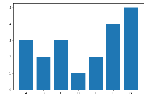
At a glance, we can easily compare the counts of our classes/categories/variables. The ability to do this is one main advantage of bar graphs. On the x-axis we have the categories and on the y-axis we have counts of each category.
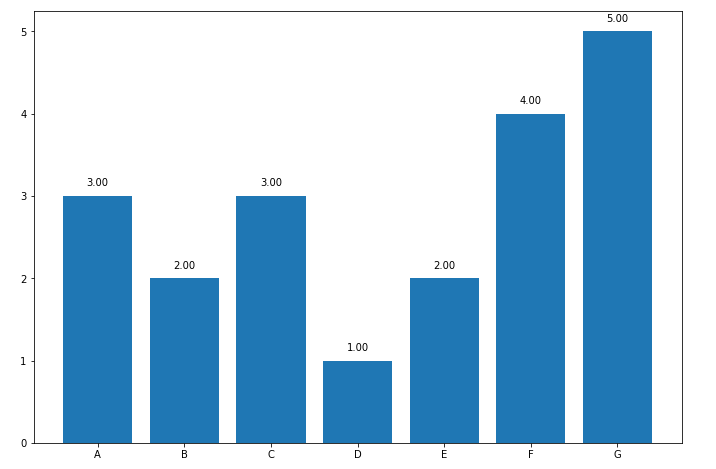
We can actually improve this bar graph by adding data labels to the bars so that consumers of the data don’t have to guess each count of each category. We can re-write our code as the following to achieve this:
import matplotlib.pyplot as plt
import pandas as pd

df = pd.DataFrame({'CLASS_TYPES': ['A','A','A','B','B',
       'C','C','C','D','E',
       'E','F','F','F','F',
       'G','G','G','G','G']})

fig = plt.figure()
ax = fig.add_axes([0,0,1.5,1.5])
classTypes = ['A','B','C','D','E','F','G']
classCount = [len(df[df.CLASS_TYPES == 'A']),
              len(df[df.CLASS_TYPES == 'B']),
              len(df[df.CLASS_TYPES == 'C']),
              len(df[df.CLASS_TYPES == 'D']),
              len(df[df.CLASS_TYPES == 'E']),
              len(df[df.CLASS_TYPES == 'F']),
              len(df[df.CLASS_TYPES == 'G'])]

ax.bar(classTypes,classCount)

for x,y in zip(classTypes,classCount): #to add data labels

    label = "{:.2f}".format(y)

    plt.annotate(label, # label text
                 (x,y), # The point (x, y) to annotate
                 textcoords="offset points", # offset (in points) from the xy value
                 xytext=(0,10), # position (x, y) to place the text at.
                 ha='center') # horizontal alignment is center in this case

plt.show()
Everything is the same except that we added a FOR-loop that will apply the data labels to the top center of each bar in our plot.
- The plt.annotate() method allows us to annotate the point provided with text.
- In this case, we choose to annotate with the data label but it can be anything else.
- The FOR loop allows us to add annotation to each bar in our bar plot one after the other.
- The plt.annotate() method requires that we supply the label text, the point to annotate and a few other parameters in order to show the intended result. We will place the data labels a little above each bar.
Now we have:
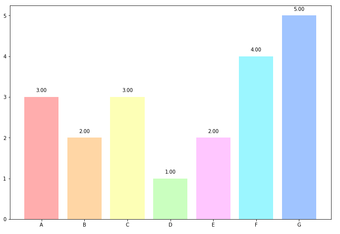
A little better right? ✨✨ Now we can go even further and add color to our bar graph so that we can differentiate the classes. Using the same color gets repetitive after a while. Fortunately, this is simple! By changing one line in our code we can add some color to our graph:
ax.bar(classTypes,classCount,color=['#ffadad', '#ffd6a5', '#fdffb6', '#caffbf', '#ffc6ff','#9bf6ff','#a0c4ff'])By adding the color parameter to the ax.bar() method we can change the color of the bar faces. Now we have:
Please check our other tutorial on Python Bar Plots.
You can find the full source code at GitHub HERE. Thanks for reading! Good luck 👌👌👌.