Ploty Bar Chart in Python can be created using Plotly Express. Plotly Express is officially described as “a terse, consistent, high-level API for creating figures”. First, let’s install the library if you don’t already have it:
pip install plotly-expressNow, let’s create a simple bar chart with the following code:
import plotly.express as px
import pandas as pd

d = {'CLASS_TYPE': ['A','B','C','D','E'], 'STUDENTS': [120,225,30,109,308]}

df = pd.DataFrame(data=d)

fig = px.bar(df, x='CLASS_TYPE', y='STUDENTS')
fig.show()
Let’s explain what is going on here:
- We import the plotly.express library because is the recommended starting point for creating most common figures. The plotly.express module contains functions that can create entire plots at once.
- We import pandas because our dataset is a dataframe.
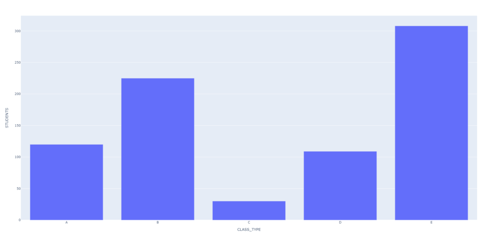
- d is our dataset. We have 2 columns and 5 rows. One column is our CLASS_TYPE and includes 5 classes A, B, C, D and E. The other column STUDENTS are the amounts of students that belong to each class. From this data we create our dataframe df.
- px.bar() accepts our dataframe, the CLASS_TYPE on the x-axis and the STUDENTS count on the y-axis. I returns an object of type plotly.graph_objects.Figure which we assign to fig.
- fig.show() shows our simple bar graph/bar plot in a new browser window in the default browser. It has a small menu bar on the upper right as well as tooltips when you mouse over the bars.
When we execute our code we get the following output:
We can flip the axis such that CLASS_TYPE is on the vertical axis and STUDENTS is on the horizontal axis:
fig = px.bar(df, x='STUDENTS', y='CLASS_TYPE')
fig.show()
And now we have the following plot:

We can add different colors to the face of each bar with the following code:
fig = px.bar(df, x='STUDENTS', y='CLASS_TYPE', color='CLASS_TYPE', title='Students by Class')
fig.show()
Adding the color parameter and the title parameter gives us the following graph:
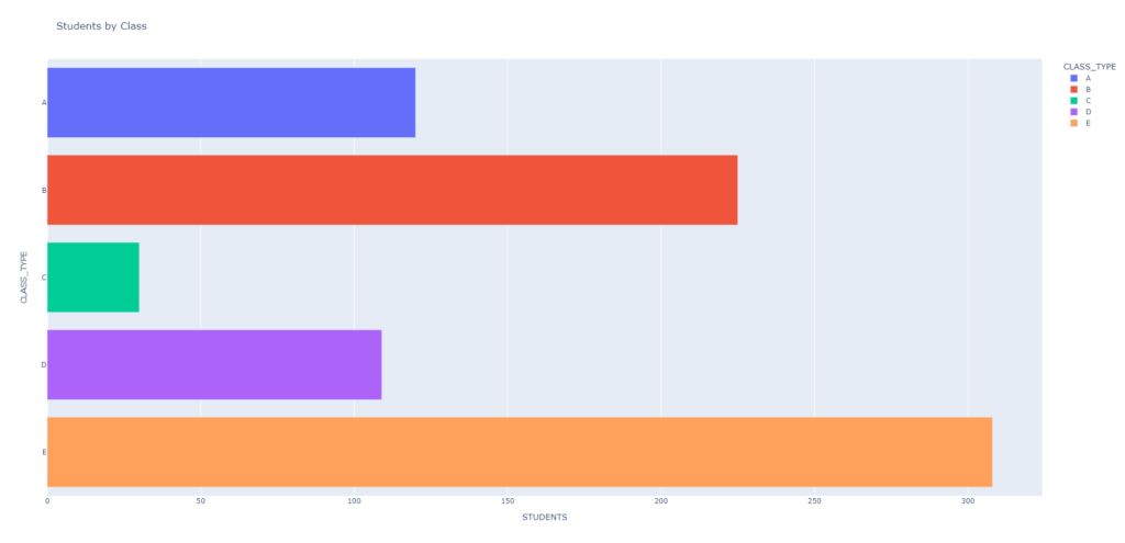
Notice that we added a title to our chart along with colors to easily differentiate the bars. Recall that bar plots are best at allowing us to compare categories of data.
Finally we can add data labels with the following code:
fig = px.bar(df, x='STUDENTS', y='CLASS_TYPE', color='CLASS_TYPE', title='Students by Class',text='STUDENTS')
fig.show()
The above code gives us the following output:

You can now see the data labels that tell us the counts of each CLASS_TYPE. Each is placed on the relevant bar ofr ease of reading.✨✨✨
Hopefully you found the above tutorial to be helpful. Find the full source code HERE and check out another great bar plot tutorial HERE. Good luck in creating your Plotly Bar Chart In Python! 👌👌👌