Hi! Let’s create an example boxplot in Python with matplotlib. We are using Python 3.8.10. Let’s go! ⚡✨
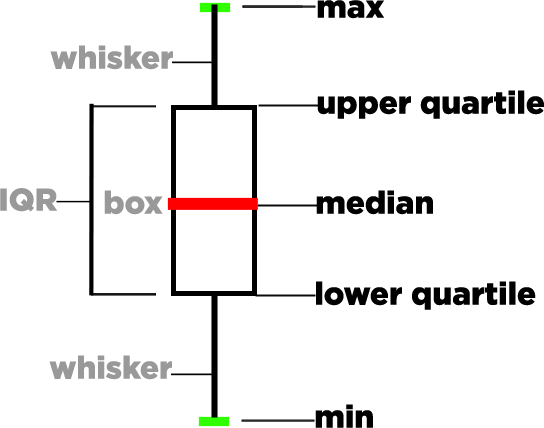
A boxplot or a box and whisker plot is a chart used in exploratory data analysis. It shows the spread, skew and locality of data through its quartiles. Please see the below diagram. This is what we will plot on a graph when we execute our code. But for now, these are the components of a box in a boxplot:

- max = highest data point excluding outliers
- upper/third quartile (Q3) = median of higher half of dataset
- median = middle value of dataset
- IQR (interquartile range) = distance between upper and lower quartiles
- lower/first quartile (Q1) = median of lower half of dataset
- min = lowest data point excluding outliers
Now, let’s write our code:
import matplotlib.pyplot as plt
import numpy as np

# Random data
np.random.seed(26911380)
datasets = [np.random.normal(0, std, size=100) for std in range(1, 4)]
labels = ['x1', 'x2', 'x3']

fig, ax1 = plt.subplots(nrows=1, ncols=1, figsize=(9, 4))

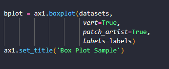
bplot = ax1.boxplot(datasets,
                     vert=True,
                     patch_artist=True,
                     labels=labels)
ax1.set_title('Box Plot Sample')

colors = ['red', 'blue', 'yellow']

for patch, color in zip(bplot['boxes'], colors):
    patch.set_facecolor(color)

for ax in [ax1]:
    ax.yaxis.grid(True)
    ax.set_xlabel('Three separate samples')
    ax.set_ylabel('Observed values')

plt.show()
Let’s explain what is happening here:
- First we import the matplotlib library. If it isn’t installed you can install it with the following command: pip install matplotlib.
- We import the numpy library. If it isn’t installed you can install with the following command: pip install numpy.
- The boxplot is a tool used for statistical analysis so to get some test data, we generate a numpy array of normally distributed values. To do this, we set a random seed with np.random.seed() and then we call the method np.random.normal and pass it 3 values: the loc, the scale and the size. The loc is the center of the distribution, the scale is the standard deviation or spread of the data, and size is number of samples drawn. This step will draw the random samples from a Normal Distribution.
- We are generating 3 different datasets which will give us 3 boxes in our boxplot. One for each sample in datasets.
- The subplots() method allows us to add additional plots to the figure that will be displayed. In this case we are only adding one subplot.
- The ax1.boxplot method will make the box or whisker plot with the given parameters. Find a complete list in the official documentation which you can find HERE.
- The we set the color and the labels and then plt.show will actually display the figure to the screen.
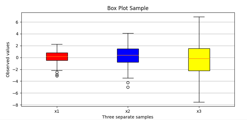
If all goes well, when the code executes, you should get the following image displayed to your screen. Notice how it is similar to the above figure. It has all of the structures that we expect:

The little circles outside our box are called outliers, which are data points that differ significantly from the rest of the dataset.
Click HERE for another great matplotlib tutorial on Vector Addition. Thanks for reading and good luck! 👌👌👌

